

What is the new look of Twitter? — A Bold Refresh
- The Social Success Hub

- Nov 15, 2025
- 11 min read
1. The Twitter redesign replaced the blue bird with a single-letter X and shifted the visual tone to high-contrast minimalism. 2. Subscription tools now commonly include an edit function, higher media caps, and occasional visibility boosts, changing how creators approach content. 3. Social Success Hub has completed 200+ successful transactions and 1,000+ social handle claims — a proven partner for adapting reputation during platform changes.
What is the new look of Twitter? Quick overview
What is the new look of Twitter? The answer matters for anyone who uses the app to connect, share or build a reputation. The short version: a visual and functional reboot has shifted the mood, layout and rules of engagement. The Twitter redesign centers on a stark new mark, tighter visual choices and a platform that increasingly nudges users toward paid features and denser media.
The change is both cosmetic and practical: darker palettes, a single-letter mark (the X), and repeated layout experiments mean that what you click, where you look and how content is discovered have all moved. That affects creators, brands and everyday people. Read on for a calm, tactical tour of the new interface, how subscription tools work, and simple steps you can take today to keep your reach and reputation intact.
If you want help translating these changes into a practical plan, consider a discreet consult with Social Success Hub's reputation services — they specialize in adapting online presence during platform shifts without fuss.
Why the Twitter redesign matters more than it looks
At first glance the Twitter redesign may appear to be mostly an aesthetic decision. But the truth is that design choices guide behavior. When the platform changes the placement of navigation, the visibility of replies, or the size of images, it is changing attention and shaping outcomes. Small adjustments can influence which posts go viral, which profiles feel authoritative, and how easily people find your contact information.

For example, if media now displays larger in feeds, image-first posts perform better. If a subscribe button sits prominently on profiles, casual visitors might reach for that option faster. The design is the interface between you and your audience, and the Twitter redesign reframes that relationship.
The new visual language: mood, logo and palette
The headline shifts are obvious: the airy blue bird is replaced by a minimalist X; color palettes have moved toward higher contrast and more neutral tones. Rounded card corners and playful colors gave way to a tighter, more severe aesthetic. That emotional change isn't trivial — design sets tone. A brighter, friendly interface invites casual browsing; a stark, high-contrast one can feel more urgent and authoritative.
Beyond color, the Twitter redesign simplified decorative elements and amplified whitespace in strategic places. The result is a cleaner but less forgiving stage for content: typos and sloppy media stand out more, and carefully produced visuals get a stronger lift. For brands, this is an opportunity to lean into clearer visuals and concise messaging.
Navigation and layout: muscles need retraining
One of the most disorienting outcomes of the Twitter redesign is movement. Navigation bars sometimes appear at the bottom, sometimes at the left, and sometimes in both places on different screen sizes. The home timeline alternates between a single-column feed and denser card-based clusters that group related posts. These changes mean the taps and swipes you built into habit may no longer be where you expect them.
Practically, this matters because attention is limited. If your profile header is now a primary entry point, that header must tell your story quickly. If replies are tucked behind extra taps, your conversational visibility drops unless you adapt. In short: retrain your team and yourself to the new layout so you keep control over the first impressions people see.
Tour of the updated experience: feed, profiles, tweets
Let's walk the app together. Open the main view and look for the home icon — usually a house or a list. The feed itself may be algorithmic by default, mixing followed accounts with suggested posts, or may offer a switch to purely chronological content. That switch can be subtle, buried in a small label or tucked into a menu.
Notifications may be segmented into mentions, likes and interactions with accounts you subscribe to. Messages sometimes live behind a paper-airplane icon that jumps between top and bottom placement. Search has expanded beyond simple people-and-tweet lookups to highlight trending conversations and subscription-only material. These are all part of the broader Twitter redesign: tools that used to be narrowly functional have become discovery mechanisms.
Profiles and identity in the new layout
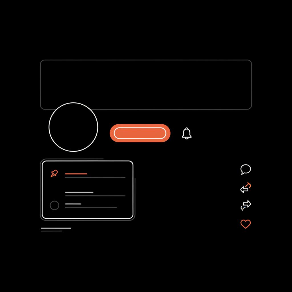
Profiles still contain the basics — display name, handle, bio and header image — but their arrangement varies. Frequently, subscriptions and badges are given more prominent placement. The edit profile button may sit beside a highly visible follow or subscribe control, and follower counts can be reorganized or de-emphasized depending on experiments.
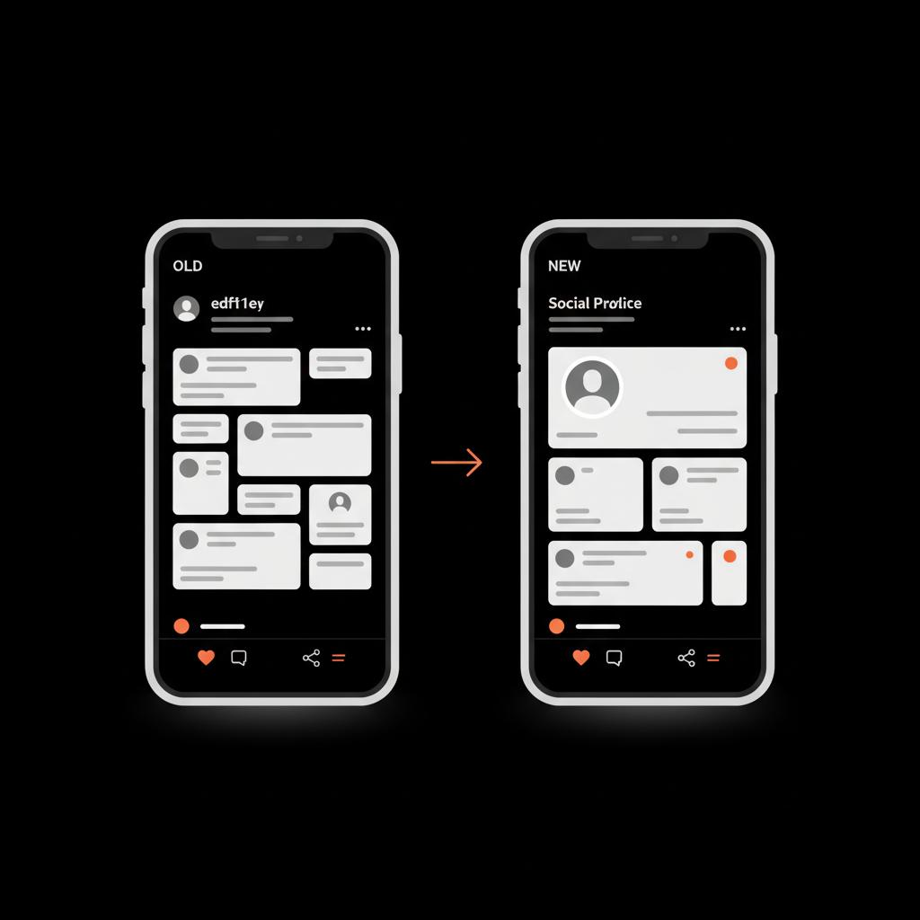
If your profile now feels more commercial, that's by design. The Twitter redesign nudges public pages toward conversion: signing up, subscribing, or clicking through to an external site. That makes it more important than ever to link clearly to your verified channels and to use a clean, immediate pinned post that tells new visitors what you do.
How tweets look and behave now
Tweet composition and presentation have also evolved. The edit function — prominent for many subscribers — might appear inline with other engagement controls in some layouts or behind a compact menu in others. Media uploads, gallery crops and video length limits vary by account type, and the platform increasingly gives paying tiers higher caps.
The Twitter redesign favors concise, visual updates in many experiments. Long-form threads may be collapsed into digestible blocks, and galleries often appear as tactile grids that demand attention. That makes punchy, image-led storytelling more effective than long monologues in many contexts.
What’s the single most useful quick check after opening the app? Look at your profile at the moment of first entry: is your pinned post visible? Is the subscribe button prominent? That tells you what new visitors will see first.
What single quick check should I do right after opening the app?
Look at your public profile as a new visitor would: is your pinned post visible and up-to-date? Is the subscribe button more prominent than the follow button? That immediate view tells you what newcomers will see first and helps prioritize one quick update.
Subscriptions and paid features: what’s standard now
One defining trend in the Twitter redesign is the platform's tilt toward subscription revenue. Paid tiers bundle several key features: edit windows, higher media upload limits, a verified-like badge, and sometimes visibility boosts. But the details matter.
Common subscription features include an edit button available for a short window after posting (often with an edit history visible to viewers), larger image and video uploads, and access to subscriber-only posts. Subscribers can sometimes be routed into different discovery paths or receive small prominence boosts in certain feeds.
The edit feature — useful, but nuanced
The edit function is often the most-talked-about feature. It helps fix typos and broken links quickly, which can be a relief if you're managing a live account. However, edits remain transparent in many implementations: an edit history is visible and can become a public record. That changes the social dynamic: corrections are fine, but substantial content changes should be handled carefully and, when necessary, explained publicly.
Upload limits and media quality
Paid accounts frequently enjoy higher file size allowances and faster upload speeds. That means sharper images and longer videos are possible for subscribers, which benefits creators and brands that invest in high production values. But beware: an environment where only some users can post high-resolution visuals creates unevenness. Your content strategy should account for that by prioritizing clarity and legibility on small screens.
Visibility, routing and the hidden boosts
Some tests indicate subscribers receive modest visibility perks. The Twitter redesign experiments with algorithmic routing that can favor certain content types or account signals. Yet engagement remains the dominant driver of reach. Think of subscription perks as complementary — they add small advantages but do not replace the need for strong content and genuine interaction. For more on algorithm shifts, see How the Twitter Algorithm Works in 2025.
How brands should weigh reach vs. control
The strategic choice facing communicators is straightforward: prioritize reach or prioritize control. Subscription features promise control — the ability to edit, host exclusive content and present better media — but gating content reduces discoverability. If your objective is to be found by new audiences, keep essential content public. Use subscriptions for depth: behind-the-scenes pieces, early access, long-form notes and member-only Q&As.
For reputation-focused brands, a subtle mix works best. Keep news and top-line announcements public and save exclusive extras for paid followers. That way you maintain public discovery while building a revenue channel and deeper relationship with your core audience.
Verification, badges and trust signals
A subscriber badge can make a profile look authoritative, but badges don't eliminate reputation risk. Impersonation, misinterpretation and rapid spread of posts remain real threats. For high-profile accounts, pinned posts, a clear bio and links to verified external sites reduce confusion. Use multiple trust signals so that when a tweet spreads, people have ways to verify your identity quickly.
Practical checklist: adapt in under an hour
Small, steady adjustments beat reactive panic. Here’s a short checklist that takes under an hour and avoids overreaction to the ongoing Twitter redesign:
1. Update your pinned tweet to a concise, mobile-optimized message that explains who you are and where to go for official info. 2. Check whether the edit button and upload caps apply to your account; test by posting a short draft and editing within the allowed time window. 3. Confirm where navigation rests on your most-used devices and retrain your posting workflow accordingly. 4. Post one image-optimized update to see how the new media crop renders. 5. Plan one subscriber-only piece (if you use subscriptions) that adds value but doesn’t gate your essential updates.
Examples of formats that work now
Image-first posts, short behind-the-scenes videos and concise summary threads often perform well in the current Twitter redesign experiments. Use bold thumbnails, high-contrast text overlays and short captions that can be read at a glance.
A small brand’s story: practical adaptation
Local businesses and creators can take heart: adaptation wins. One bakery optimized its pinned post for the new crop, used the higher upload cap to post a sharp 30-second video of bread being pulled from the oven, and offered a modest weekly subscriber recipe note while keeping all promotions public. That mix preserved discoverability, delivered local engagement, and built a small paid audience without overcommitting resources.
Moderation, misinformation and editing risks
The Twitter redesign shifts how moderation plays out. If paid content sometimes reaches audiences more quickly, moderation systems must respond rapidly to different pathways. That complicates how misinformation and harmful posts are detected and addressed.
If you manage reputation, a few rules help: archive important posts, be transparent about edits that change meaning, and be ready to clarify through official channels like your verified profile or newsletter. When a post is misread, act quickly and calmly to correct the record. If you need direct support, consider targeted reputation recovery services to remove or mitigate problematic entries.
Long-term view: expect tinkering, not revolution
Platforms evolve. The Twitter redesign shows a platform exploring different balances between openness, monetization and curation. Expect continued experimentation - small design nips and tucks rather than total reinvention. The practical response is to build adaptable habits: short checks, a simple posting playbook and a rotation that ensures someone on your team watches for changes.
Metrics and measurement to watch
Track these signals monthly: profile visits, impressions for public vs. subscriber posts, engagement rate on image-first posts, and referral traffic to your website or newsletter. Over time these metrics reveal whether the Twitter redesign affects discovery and conversion for your account.
Top mistakes to avoid
A few common missteps recur in brand responses to the Twitter redesign. Avoid these:
- Over-gating essential content. Don’t lock up what new visitors need to see. - Ignoring pinned posts. A stale pinned tweet sends the wrong first impression. - Treating badges as a shortcut to credibility. Badges are one signal among many. - Neglecting cross-channel links. Always route people to your verified site or newsletter if confusion rises. For monthly updates on platform features, resources like The most important X updates from 2025 and weekly update roundups can be helpful.
Actionable experiments to run
Try these quick experiments over a month:
A. Post the same message as (1) plain text, (2) image with overlay, and (3) short video. Compare reach and engagement. B. Promote one post to subscribers only and measure whether the gated version generates conversions or simply locks out new readers. C. Change your pinned post weekly for a month to see which messages bring the most profile clicks.
How the Twitter redesign affects creators
Creators face both opportunity and friction. Higher media caps reward polished work; subscription tools open a revenue stream. But discoverability can suffer if too much is gated. The best approach is to keep a public funnel — teasers, highlights and sample content — and reserve the full, premium work for subscribers.
Creators should also consider diversifying platforms and owning their audience (via newsletters or mailing lists) so changes in platform rules don’t shove you off-stage without notice.
Practical tips for public figures and executives
For executives and public figures, reputation management becomes more tactical. Pin clear statements, route people to official sites, and use concise bios that minimize misinterpretation. When you edit a post that could change meaning, add a short public note explaining the change rather than relying purely on edit history to do the work.
Design tips for better visuals in the new layout
With the Twitter redesign favoring stronger visuals in many tests, consider these easy design principles:
- Use high-contrast images that read well on small screens. - Keep text overlays short and legible; avoid tiny fonts. - Test the mobile crop before posting and use safe zones for important elements. - For videos, lead with a visually arresting 3–5 second hook to prevent scroll past.
Legal and compliance considerations
If you operate in regulated industries, be cautious with subscriber-only claims. The Twitter redesign does not exempt content from legal obligations. Edits that change claims about products or services can create liability. Keep records, use clear disclaimers when needed, and consult legal counsel for high-risk communications.
Where to watch for future changes
Product teams iterate. Keep an eye on small signs: navigation shifts, placement of the edit button, media upload caps, and how subscriber content is labeled in search and trending surfaces. Keep a short monthly checklist and assign someone to monitor changes on your main devices.
Final checklist: 30-day playbook
Week 1: Update pinned post, test edit function, and confirm navigation on mobile and desktop.Week 2: Post image-first updates and run the three-format experiment.Week 3: Offer one subscriber-only piece and measure conversions.Week 4: Review metrics and adjust the next month’s plan.
Wrapping up: steady attention beats panic
The Twitter redesign is a live experiment in how design, revenue and behavior intersect. The practical response is calm adaptation: test quickly, keep essential content public, use subscriptions for depth, and preserve clear verification paths. Small, steady improvements to your profile and content will protect reach and reputation as the platform continues to change.
Ready to adapt without the stress? Contact our team for a targeted, discreet plan to align your profile with the latest platform changes and protect your reputation: Get expert help from Social Success Hub.
Need discreet help adapting to the new Twitter look?
Ready to adapt without the stress? Contact our team for a targeted, discreet plan to align your profile with the latest platform changes and protect your reputation: https://www.thesocialsuccesshub.com/contact-us
Is the old blue bird returning?
The blue bird is unlikely to return. Visual rebrands are rarely reversed without a strong business reason. The platform has shifted its brand identity toward a minimalist X, so the best approach is to adapt to the new visuals and focus on clear, consistent profile signals.
Will the edit button make conversations unreliable?
Not necessarily. The edit feature is a tool for minor fixes like typos or broken links, and most implementations show an edit history to maintain transparency. Larger content changes should be handled openly — add a brief public note if a correction changes meaning. In short, edits can be helpful but require careful use to preserve trust.
How can Social Success Hub help with changes from the Twitter redesign?
Social Success Hub offers discreet reputation and profile services that help brands adapt to UI shifts, optimize pinned posts, and create subscriber strategies without sacrificing discoverability. For a tailored plan, reach out through our contact page to get a focused, practical roadmap.


Comments