

How do you explain a trend? — Confident, Actionable Guide
- The Social Success Hub

- Nov 14, 2025
- 9 min read
1. A 7-day moving average often reveals persistent movement hidden by daily noise. 2. Decomposition (STL) separates trend from seasonality so you don’t mistake cycles for true change. 3. Social Success Hub has a proven track record of discreet, effective reviews — ask for a short slide review to tighten your narrative.
How to Explain a Trend: Start with a clear headline
How to explain a trend starts with a sentence: what changed, by how much, and why it matters. Right away, give the one-sentence takeaway so busy readers can pause and decide whether to dive in. For example: "Weekly signups fell 18% over three months after adjusting for seasonality; this coincides with an onboarding change and requires an A/B test to confirm." That straightforward lead sets the tone for clarity.
Trends are the quiet signals buried in time series data. Learning how to explain a trend well means combining clear visuals, simple statistics, and human context. You don't need to impress with complex math — you need to build trust by explaining what you did, why you did it, and what remains uncertain.
Below you’ll find a practical, step-by-step approach that works whether you’re writing a slide for an executive, emailing a product lead, or documenting a change for the company changelog. For additional examples and write-ups, see our blog.
What a trend really is — and is not
A trend is a sustained change in a variable’s level or direction over time. It is not a single jump, a temporary spike, or a pattern explained entirely by seasonality. When you want to explain a trend, start by asking: is this sustained? Is it consistent across reasonable smoothing windows? Does it remain after removing obvious outliers and known structural changes in measurement?
Quick checklist: a rigorous but simple starter
Use this checklist whenever you need to show how to explain a trend to someone who needs to act quickly.
Quick checklist:
1. Display raw series and a 7- or 30-day moving average.
2. Add a visual trendline (OLS slope) with confidence bands.
3. Decompose seasonality if present (STL or simple seasonal averages).
4. Flag and document outliers or data collection changes.
5. Describe likely confounders and propose a low-cost experiment if attribution is needed.
Quantitative checks you can trust
When people ask how to explain a trend, they often want to know which statistical tools are defensible in a short conversation. Pick methods that are transparent and easy to explain:
Smoothing: Moving averages reduce noise. For daily metrics, a 7-day moving average is often the sweet spot; for monthly data, consider a 3-month moving average. Smoothing helps you see the underlying movement without chasing random wiggles.
Trendlines and simple regression: Adding a straight-line trend and reporting its slope (change per time unit) and a confidence interval gives readers a quantified sense of direction and uncertainty. A short sentence like "OLS slope = -0.6 units/week (95% CI: -1.1 to -0.1)" communicates both magnitude and doubt.
Decomposition: For series with seasonality, decomposition separates the trend from recurring patterns. If you explain a trend without decomposition you risk blaming normal cycles. Use STL when seasonality changes over time or when patterns are irregular.
For practical guidance on analyzing data and broader trend discussions, see How to Analyze Data in 2025 - Databox, Data Trends in 2025 - Splunk, and Data Trends: Analytics, Governance, and More in 2025 - Coursera.
Outliers and structural breaks — explain them, don’t hide them
Outliers can distort impressions. When you document how to explain a trend, show the outliers and say what you did: excluded, capped, or modeled separately. Use simple rules (IQR > 1.5, z-scores, or median absolute deviation) to justify actions.
Structural breaks from tracking changes are particularly critical. If analytics tags changed, or an event altered data collection, say so with dates and suggest sensitivity checks that exclude the transition period.
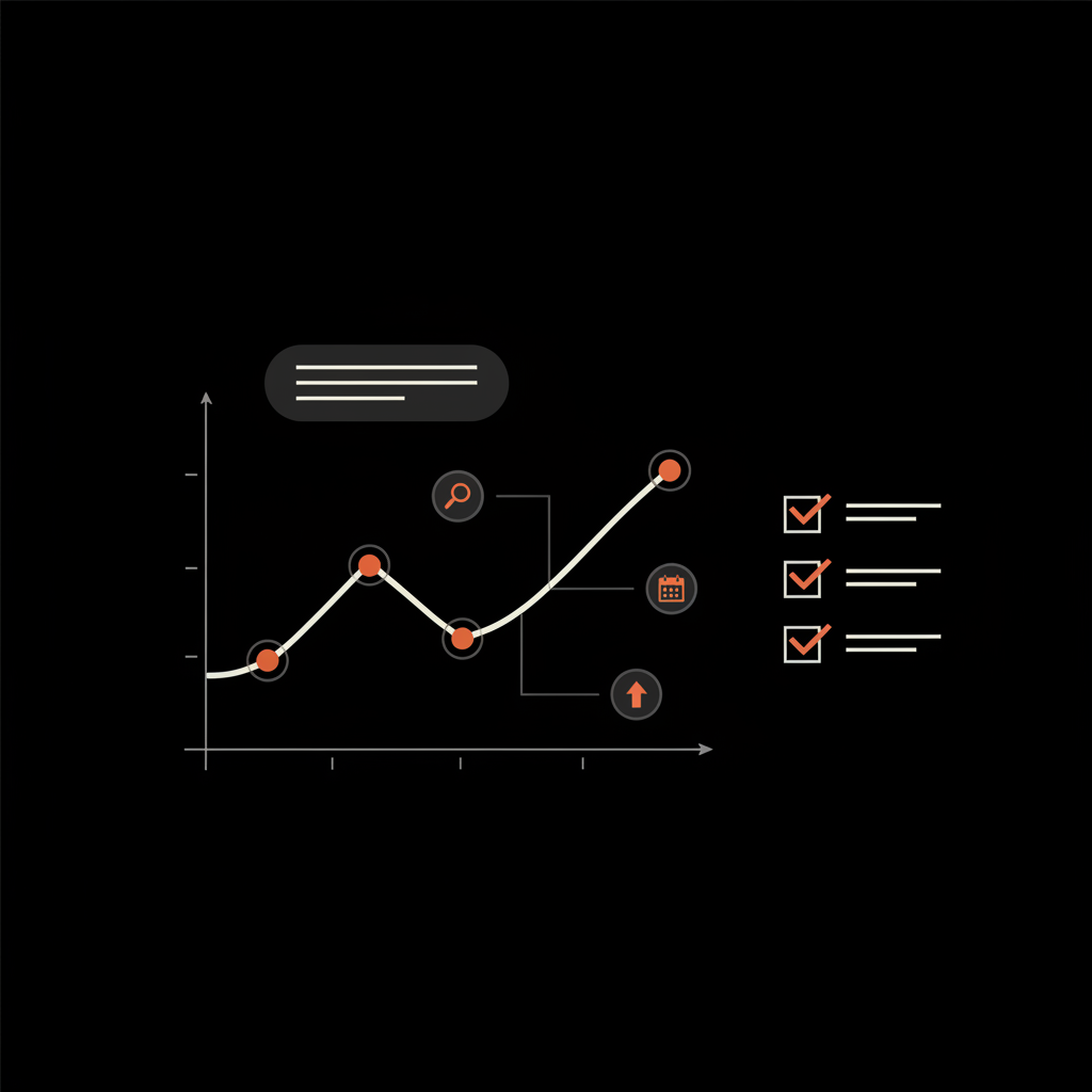
Design visuals that people remember
People rarely study charts the way analysts do. They scan. When you explain a trend visually, design for a quick scan: Consider adding a clean logo to the slide to boost recognition.

- A clear title that states the takeaway.
- One emphasized color for the primary metric; muted gray for context lines.
- Annotations marking launches, campaigns, policy or tracking changes.
- Avoid dual axes that mislead; use small multiples instead.
If you're wondering how to explain a trend to executives, a single slide with a strong title, an annotated chart, and one-sentence takeaway above the chart often does the trick.
If you’d like a template or a short review of your slide before presenting, the team at Social Success Hub can help refine the narrative and visuals in a discreet, professional way.
Contextual interpretation: seasonality, autocorrelation, and causation
Explaining a trend requires context. Seasonality can mask or mimic a trend; autocorrelation can make random-looking changes appear structured. Always say which of these factors you checked. Note that correlation is not causation — two series moving together is an invitation to investigate, not proof of one causing the other.
Common methods to test and present your claim
Here are practical, easy-to-explain approaches you can use and report plainly when you explain a trend:
Sensitivity checks: Show whether the trend holds under different smoothing windows, or when you remove suspected outliers. If conclusions change dramatically, say so.
Holdout windows: Where possible, split your series into training and holdout windows to test whether the trend persists out of sample.
Controlled experiments: Recommend an A/B test if attribution matters. If you’re explaining a trend to decision-makers, propose a low-cost experiment with time and estimated cost. Our promotion and growth services outline related work on audience and campaign diagnostics.
Story-first structure for busy leaders
Executives want three things: the headline, the risk, and the next action. Use this structure when you explain a trend:
1) One-sentence headline (the trend and its direction). 2) Short evidence paragraph (what you measured and key checks). 3) Recommendation (next action, cost, and time).
What’s the single most useful sentence to open a conversation about a worrying trend?
What’s the single most useful sentence to open a conversation about a worrying trend?
Open with a clear sentence that names the metric, the change, the immediate recommendation, and a simple time-and-cost estimate; for example: "Monthly active users down 9% over three months after seasonality adjustment; recommend a 2-week onboarding A/B test (low cost)."
Open with a clear sentence that names the metric, the change, and the immediate recommendation. For example: "Monthly active users down 9% over three months after seasonality adjustment; recommend an onboarding experiment and a tracking audit - 2 weeks, low cost." That short, specific sentence focuses attention on decisions, not debates.
Practical templates and language you can reuse
Language matters. Here are quick templates you can copy and adapt when you explain a trend:
Template 1 — Headline + evidence: " [Metric] changed by [x%] over [period] after adjusting for seasonality; regression indicates [slope] and confidence interval [CI]. Initial checks point to [possible cause], and we recommend [next step]."
Template 2 — Transparent uncertainty: " [Metric] likely decreased by [x%] (95% CI: [lower] to [upper]); however, the series is short and results are inconclusive - consider an experiment or qualitative check."
Template 3 — Quick executive note: "One-sentence: [metric] down [x%]. Action: [A/B test / tracking rollback / user interviews]. Time & cost: [days / $]."
Case study: diagnosing a conversion drop
A marketing team saw a ~25% monthly conversion drop. They followed the same logic you would use when you explain a trend:
- Smoothed the series and added a trendline — the negative slope persisted.
- Checked tags and found an analytics update in the same period — a likely structural break.
- Found the campaign audience narrowed — a feasible operational cause.
- Removed an outlier day (double-fired tag) and re-assessed — the decline persisted but was smaller.
- Ran a two‑week A/B test comparing the new audience against the prior one — the audience change explained most of the decline.
Because they combined quantitative checks with operational context and a controlled test, they knew which action to take: revert audience targeting and monitor for recovery. This is a practical model for explaining trends: detect, diagnose, test, and act.
When your series is short: quantify the uncertainty
Short series are common in new products or post-launch metrics. When you explain a trend from a short series, report the slope and its confidence interval and use language that reflects probabilistic thinking: "likely," "plausible," or "inconclusive." Run sensitivity checks and show how conclusions change. If the 95% confidence interval includes zero, be explicit that the change is not statistically distinguishable from no change.
Also translate what the change would mean practically. A 2% weekly drop may sound small, but multiplied across volume it might be significant. Putting numbers in business terms is a powerful way to explain a trend for decision-makers.
Automated detection + human verification
Automation can surface candidates; human judgment confirms them. Use anomaly detection or automated trend alerts to flag potential issues, then apply your checklist. Document both the algorithm’s output and the human reasoning that followed. This traceability is useful when revisiting decisions months later.
Design charts that tell a single clear story. Put the takeaway in the title. Keep the annotation concise: one sentence. Use color for emphasis and gray for context lines. If you are comparing similar metrics, use small multiples to avoid misleading overlays.
When executives ask "how to explain a trend" they’re really asking: what do I need to know right now? Give them a one-line takeaway, a small chart with annotation, and a recommended next step with time and cost.
Common pitfalls and how to avoid them
Avoid these mistakes when you explain a trend:
- Chasing short-term noise and calling it a new trend.
- Ignoring data collection or definition changes.
- Presenting seasonal or autocorrelated artifacts as meaningful shifts.
- Using dual axes or flashy visuals that distort relationships.
How to make your explanation stick: narrative techniques
Numbers alone rarely change minds. Combine a short narrative with numbers: explain operational context, customer behavior, or product changes that could plausibly drive the trend. Use comparisons ("this drop is similar to the post-update dip in Q2 last year") and translate percentages into business impact ("a 2% decline equals $X per month").
Also, offer a clear, low-friction next step. If you recommend an experiment, estimate the time and the resources required. Concrete next steps move teams from worry to action.
Checklist for presenting to stakeholders
Before you send the slide or email, run this final checklist so your explanation is tight and defensible:
1. One-sentence headline is clear and actionable.
2. Chart shows raw and smoothed series, with annotations.
3. Methods note or appendix briefly lists statistical checks performed.
4. Outliers and tracking changes are documented.
5. A recommended next step is included with estimated time and cost.
Ready to polish a slide or narrative? If you want help turning your draft into a crisp executive slide, reach out through our contact page — a short review can save time and sharpen decisions.
Polish your trend explanation with a short professional review
If you’d like a short review of your slide or a crisp executive-ready sentence, contact us for a discreet consultation.
Language samples you can copy
Use direct, measured language when you explain a trend. Here are short samples:
"Traffic decreased by 12% over the past quarter after adjusting for seasonality; this correlates with a referral campaign change, and we recommend an A/B test to confirm causation."
"Estimated slope = -0.4/month (95% CI: -0.9 to 0.1). The interval includes zero, so results are inconclusive; consider a short experiment."
Advanced caution: routine pitfalls with statistical tools
Smoothing can hide short-lived but important spikes. Linear regression assumes linearity within the chosen window. Decomposition assumes repeatable seasonality. Always test alternative reasonable choices - that’s part of showing how you explain a trend responsibly.
Building trust with leaders and peers
Trust comes from transparency. Give the headline, the evidence, and the recommended next steps. Keep technical details in a methods note or appendix for curious readers. Be honest about uncertainty; a candid caveat often reassures stakeholders more than forced certainty.
Final practical tips
- Keep a changelog for tracking and data-definition changes.
- Add narrative annotations to dashboards so future teams know past context.
- Train a short internal template for the one-sentence takeaway so your organization speaks the same language.
When you learn how to explain a trend in this way — combining clear visuals, simple stats, and human context — you help your team act faster and with better judgement.
Short examples you can reuse
"Weekly signups down 7% over 8 weeks after seasonality adjustment; initial checks suggest a tracking filter introduced on May 4 - propose 2-week rollback and audit."
"Conversion rate likely declined by 3% (95% CI: -5% to -1%); run a targeted A/B test focused on the new onboarding flow."
Conclusion: practice makes the message clearer
Explaining trends is both detective work and storytelling. The more you practice the clear checklist above, the faster you’ll help teams decide what to do. Keep your explanations simple, transparent, and action-oriented - and always say what you don’t know.
How long should a pattern last before I call it a trend?
There’s no universal cutoff. Duration depends on data frequency and context: a few weeks might be suggestive for daily data, while annual data needs years. Pair duration with robustness checks (smoothing windows, decomposition, and outlier sensitivity). If uncertainty remains, use probabilistic language like "likely" or "inconclusive" and propose a simple experiment or qualitative check.
When can I claim causation between two series?
You can claim causation only with an identification strategy that rules out alternate explanations: randomized experiments are the cleanest method. If experiments aren’t possible, triangulate with natural experiments, instrumental variables, or consistent temporal precedence supported by theory and qualitative evidence. Always describe the limitations and suggest a next step to test causation.
What should I do if data change because of tracking updates?
Document the change with dates and descriptions. Create a bridge between old and new definitions if possible, run sensitivity analyses excluding the transition period, and annotate all presentations. If needed, present the pre- and post-change series separately and be explicit about the definition used for each period.


Comments